
HornySpot

 Loading...
HornySpot feels like a site built for momentum. It doesn’t ask you to slow down or explain yourself too much. You sign up, confirm your details, and you’re already looking at profiles. The whole experience is shaped around speed and availability rather than careful planning.
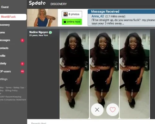
Profiles are short and practical. Most people share just enough to be noticed — a few photos, some basic traits, maybe a preference or two. You can like someone, save them for later, or quietly block and move on. Nothing feels permanent, and that seems to be the point. The platform assumes users want options, not obligations.
Navigation is simple and familiar. There’s a swipe-style section for quick browsing, filters that actually narrow things down, and a favorites list that’s easy to come back to. You’re free to explore without paying, but real interaction works on a coin system. Sending messages or media costs coins, which adds a small pause before starting a conversation. Some users earn coins through activity, others just buy them and keep going.
Support and verification exist, but they stay in the background. The site doesn’t make big claims about safety — it simply provides tools and leaves most decisions to the user.
Overall, HornySpot feels direct and lightweight. It’s designed for short attention spans, fast browsing, and conversations that don’t carry expectations beyond the moment they start.